Time Series Clustering: A Framework for understanding DMA-level demand

Introduction

Water networks generate large amounts of time-stamped data: smart meters, sensors, and other SCADA systems. At household and DMA level, these data capture rich diurnal behaviour: sharp morning surges, evening peaks, and systematic calendar effects such as weekday-weekend differences, school holidays and seasonal use (for example, outdoor use in summer; hot-water heating in winter). 

As these systems produce more data, the challenge is no longer collecting information but making sense of the main patterns when there are hundreds or thousands of repeated daily profiles. 

Time series clustering addresses this by grouping similar patterns and summarising each group with a representative shape.  

Using the daily water consumption of a DMA comprising of hundreds of properties as a running example, we set out to build a time series clustering framework. In this blog, we present the framework and outline: 

  1. what time series clustering is  
  2. why it is useful  
  3. how it is typically applied 
  4. how to interpret common algorithms and metrics  

1. What is time series clustering?

A time series is a sequence of measurements recorded over time, for example, flow in a DMA every 15 minutes. In practice, we rarely look at just one series. A single DMA with one year of data already yields 365 daily profiles. When all of these are plotted together, we end up with “spaghetti plots” of overlapping lines.  

Figure 1 illustrates this effect. Each grey curve shows one day of water use for the example DMA, plotted at 15-minute resolution. The dense overlap illustrates the challenge in understanding typical behaviour by eye when many days are shown together. 

Figure 1. Plots of daily water consumption 

Time series clustering tackles this by taking the whole collection of such series and grouping days into clusters that behave similarly. For each group it computes a representative pattern – a centroid or prototype – that captures the typical shape of the day within that group. 

For daily water demand, clustering might reveal:   

  • a weekday-type pattern with sharp morning and evening peaks,  
  • a weekend-type pattern with later and broader peaks,  
  • a summer daytime pattern with elevated midday consumption,  
  • or a flat high night-flow pattern that suggests continuous use or leakage.  

Each day is assigned to one of these groups, instead of hundreds of individual curves we obtain a small catalogue of characteristic day-types and a label for each day indicating which type it belongs to. 

Figure 2 provides a solid visualization for this idea. On the left we see the raw “spaghetti” of daily profiles. On the right, the same data have been clustered into a small number of day-types. Solid lines show the centroid shapes, while dashed lines show example days assigned to each cluster. 

Figure 2. From many daily profiles to a small set of day-types. 

As we can see in Figure 2, time series clustering distils the overlapping daily traces into a handful of day-types, each characterized by a centroid profile and a set of days assigned to it. 

2. Why use time series clustering?

Reducing complexity

High-frequency time series data are naturally high-dimensional: 96 points per day, 365 days per year, multiplied across many DMAs, customers and assets. Time series clustering reduces this complexity by representing many series by a handful of typical profiles and by describing each series by a cluster label rather than by all its individual points. 

For example, a DMA can be summarised as: 

 “60% Type 1 (weekday-like), 25% Type 2 (weekend-like), 10% Type 3 (summer daytime-intensive), and a small share of other types.”  

Figure 3 shows such a composition for this example DMA. Each bar shows the percentage of days assigned to a given day-type over the year.  

Figure 3. Cluster composition for the example DMA. 

Instead of inspecting hundreds of individual traces, we can describe the DMA in terms of a mix of day-types: a dominant Type-2 pattern, supported by several less frequent but still important patterns. Comparing these compositions across DMAs reveals where behaviour is relatively homogeneous (one or two types dominate) versus where demand is more varied. That, in turn, helps target forecasting effort and prioritise DMAs for further investigation, such as unusual night-time or seasonal patterns. 

Discovering recurring behaviour 

Rules such as “weekday vs weekend” or “summer vs winter” capture some structure, but the data contains more nuanced patterns: intermediate-season profiles, responses to events or restrictions, and profiles associated with particular customers. Time series clustering, combined with calendar information, lets these patterns emerge from data rather than being imposed in advance. 

Figure 4 shows when each day-type tends to occur over the year.   

Figure 4: Heatmap showcasing day-type distribution 

Each row corresponds to a day-type and each column to a month. Colour intensity indicates the share of that cluster’s days falling in each month. Some types occur heavily in late spring and early summer, while others are more common in autumn and winter. This calendar view highlights seasonal day-types and event driven patterns that are not visible from weekday/weekend splits alone. 

Supporting analysis and decision making 

Once cluster labels are available, they can be used as inputs to other tasks. Day-type information can be useful for: 

  • Forecasting – day-type indicators can improve short-term demand models. 
  • Leakage and anomaly screening – clusters with unusual night-time baselines or shapes can highlight DMAs for investigations. 
  • Segmentation and reporting – DMAs or customer groups can be compared by their mix of day-types. 

Extensive work in both water and energy systems has used day-type clustering for forecasting, customer segmentation and the detection of anomalous or inefficient usage patterns (see References and Further Reading at the end of this blog for examples). 

3. How time series clustering is typically applied.

What does “similar behaviour” mean? 

Before we can cluster days together, we have to decide what we mean by “days that look alike”. The same daily profile can look very different depending on which aspect we choose to focus on. We consider three ways to represent a day: 

  • Volume view – “when is water used?”  

Each day is scaled so that its total use adds up to 100% (total volume sums to one). Two days are treated as similar if the relative distribution of use over the 24 hours is similar, even if one day uses much more water overall. This view focuses on when demand occurs. 

  • Shape view – “what does the curve look like?” 

In this view, we remove the average level and scale so that all days have a similar “height”. What is left is the pattern of peaks and troughs. Two days are similar if their peaks and troughs line up, regardless of how much water was used in total. This is useful when pattern matters more than the volume. 

  • Feature view – “few key numbers per day” 

Instead of keeping all 96 points, each day is boiled down to a handful of summary numbers: total volume, time of the main peak, ratio of day-time to night-time use. The clustering then works on these few features. Days are similar if these key indicators are similar. 

Figure 5 shows three conceptual examples to illustrate different representations of a day: a morning-biased day, an evening-biased day, and flat baseline day. 

Figure 5. Different ways to represent daily profiles 

Left: volume view (relative use over 24 hours) Middle: shape view (peak and troughs), Right: a simple feature space where each day is summarized by peak time and total volume. Each representation encodes a different notion of similarity between days. 

Algorithms and number of clusters  

Once a representation and a distance measure – a way of quantifying similarity between two days – have been chosen, a clustering algorithm assigns days to groups and computes centroid profiles. Widely used options include: 

  • Euclidean k-means 
  • Dynamic Time Warping (DTW) clustering 
  • shape-based methods such as k-Shape 

All three methods take in daily profiles and return the same kind of output: a set of day-type profiles and an assignment of each day to one of these types. 

Figure 6 shows how this plays out for a single DMA when we fix the number of clusters. Each panel shows the centroid profiles produced by one algorithm, plotted in volume per property unit. All three recover recognisable day-types (for example, weekdays with morning and evening peaks and weekends with later peaks), but they differ in how they group days that have similar totals but slightly different timing or shape. This comparison helps assess how robust the inferred day-types are to algorithm choice. 

Figure 6. Comparing clustering algorithms on the example DMA 

The remaining design choice is how many clusters, k, to use. Too few clusters and distinct behaviours are merged; too many and the result becomes fragmented and hard to explain. In practice we evaluate a modest range of k values (for example, 2-6 for daily patterns), inspecting the resulting centroid shapes and calendar patterns, and check internal metrics. 

4. Algorithms and metrics: interpreting results

Clustering algorithms always produce groups; the key question is whether those groups are meaningful and robust. To assess this, we use a small set of standard internal metrics, alongside visual inspection of the profiles and calendar patterns. 

Two metrics evaluate how well separated the clusters are: 

  • The silhouette score compares, for each day, how close it is to its own cluster versus the nearest alternative cluster. A score near 1 indicates well-separated clusters; a score near 0 suggests boundary points; negative scores indicate possible misassignment. 
  • The Davides-Bouldin Index (DBI) relates the spread of points within each cluster to the distance between cluster centres. Lower values correspond to clusters that are compact and far apart.  

Figure 7 illustrates how these behave as k increases.  

Figure 7. Metrics vs k (silhouette and Davis-Bouldin) 

Figure 7 shows how the two internal metrics change as we vary the number of clusters k. The silhouette score rises quickly from k=2 and is highest around k = 5-6 while DBI drops steeply at first and then flattens out. The point where the silhouette score stops improving much and the DBI stops falling – the “elbow” – is around k=6, suggesting that adding more clusters beyond this gives little extra benefit. 

In practice, we are not looking for a precise k, but for a region where the silhouette stays high and the DBI is low. The final choice is made by checking that the corresponding day-type profiles are interpretable and consistent with domain knowledge for the DMA. 

Conclusion

This work outlined a time series clustering framework for daily household water consumption at DMA level. The framework rests on three main components: careful data preparation, a clear notion of what it means for days to behave “similarly”, and the use of standard clustering and validation tools. Together, these elements produce day-types that can be inspected to see whether they align with familiar operational behaviours—for example, weekday versus weekend demand patterns, seasonal daytime usage, or profiles with elevated night-time baselines.  

Time series clustering can yield a compact, structured set of day-types and indicators that can be used for short-term demand forecasting, leakage screening and operational reporting, helping water-industry stakeholders focus attention where it is most needed.

References and Further Readings 

[1] Liao, T. W. “Clustering of time series data—a survey.” Pattern Recognition 38(11), 1857–1874 (2005). ScienceDirect (Elsevier): https://doi.org/10.1016/j.patcog.2005.01.025 

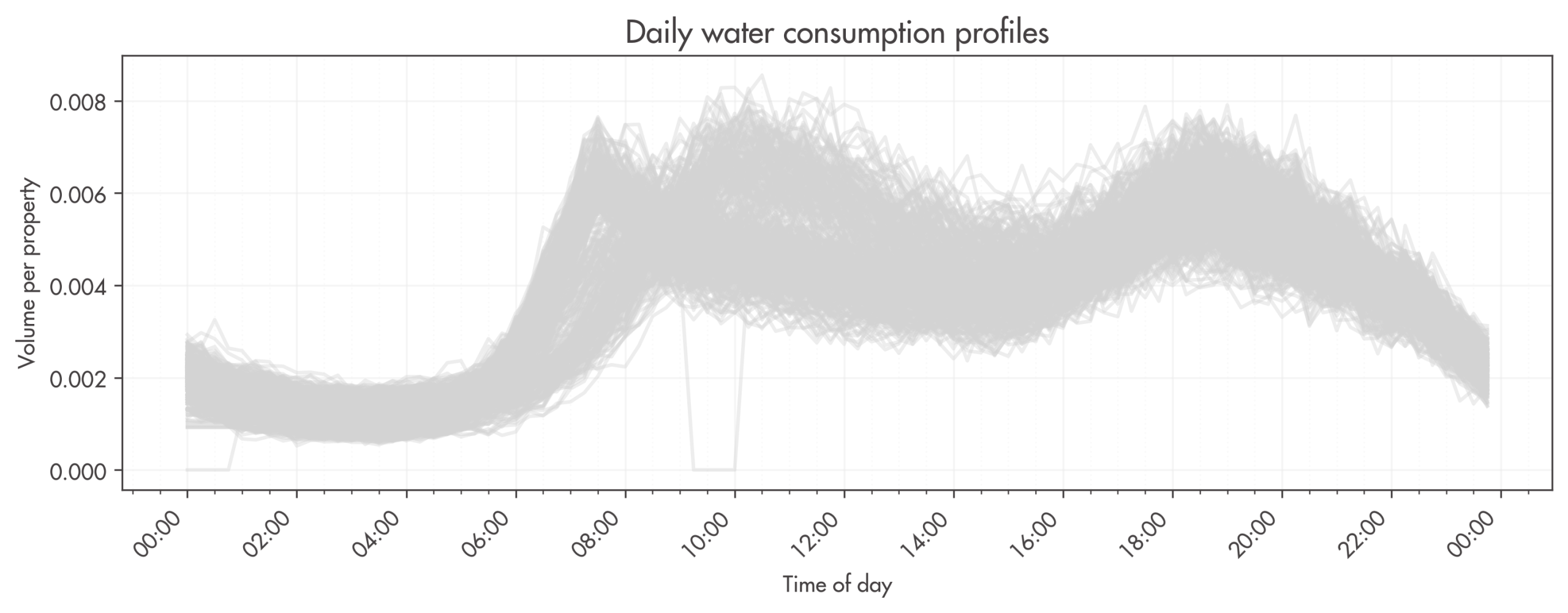
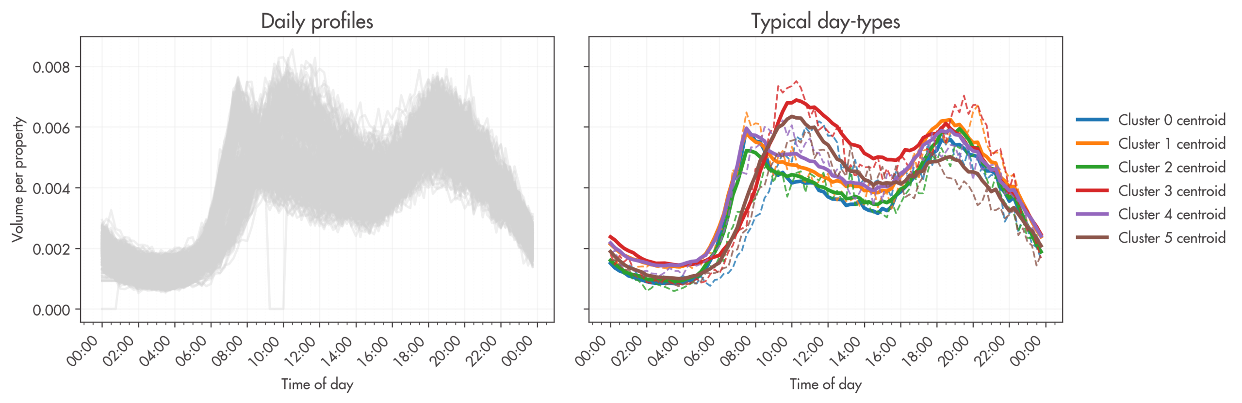
[2] Steffelbauer, D. B. et al. “Dynamic Time Warping Clustering to Discover Socio-Economic Characteristics in Smart Water Meter Data.” ASCE JWRPM (preprint: arXiv:2112.13778, 2021). https://arxiv.org/abs/2112.13778 

[3] McLoughlin F., Duffy, A., Conlon, M. “A clustering approach to domestic electricity load profile characterisation using smart metering data”, Applied Energy, Vol. 141 March 2015. doi:10.1016/ j.apenergy.2014.12.039 

[4] Lee, K. et al. (2022).
Prediction Modelling of Minimum Night Flow in Distribution Systems Using Smart Meter Data. Water, 14(3), 416. (open access) https://www.mdpi.com/2073-4441/14/3/416 

[5] MacQueen (1967) MacQueen, J. B. (1967). Some methods for classification and analysis of multivariate observations. In L. M. Le Cam & J. Neyman (Eds.), Proceedings of the Fifth Berkeley Symposium on Mathematical Statistics and Probability, Vol. 1: Statistics (pp. 281–297). University of California Press.  

[6] Rousseeuw (1987) Rousseeuw, P. J. (1987). Silhouettes: a graphical aid to the interpretation and validation of cluster analysis. Journal of Computational and Applied Mathematics, 20, 53–65. https://doi.org/10.1016/0377-0427(87)90125-7 

[7] Davies & Bouldin (1979) Davies, D. L., & Bouldin, D. W. (1979). A cluster separation measure. IEEE Transactions on Pattern Analysis and Machine Intelligence, PAMI-1(2), 224–227. https://doi.org/10.1109/TPAMI.1979.4766909 

[8] Ding et al. (2008) Ding, C., Trajcevski, G., Scheuermann, P., Wang, X., & Keogh, E. (2008). Querying and mining of time series data: experimental comparison of representations and distance measures. Proceedings of the VLDB Endowment, 1(2), 1542–1552.  

[9] Paparrizos & Gravano (2015) Paparrizos, J., & Gravano, L. (2015). k-Shape: Efficient and accurate clustering of time series. In Proceedings of the 2015 ACM SIGMOD International Conference on Management of Data (pp. 1855–1870). ACM. https://dl.acm.org/doi/10.1145/2949741.2949758

Related articles