We’re currently working with one of our clients to evaluate pressure management opportunities and, as part of this work, we must gain an understanding of potential losses in pressure with the flow of water through the network. To do this, we look at the difference between the total pressure head from an area’s inlet to a second sensor, typically at its critical point. By plotting this head loss against the metered flow data, we can characterise the relationship between flow into the area and the losses through it. In this blog post, we’ll share some examples of these plots and discuss what they can tell us about the network.
While exploring these examples, we’ll discuss three key concepts used in interpreting the derived relationship between head loss and flow:
- Intercept – We expect the line of the derived relationship to intercept the y-axis at zero, which corresponds to zero head loss at zero flow.
- Shape – We expect that the derived relationship will predict increasing head loss with increasing flow, and that the gradient of the derived line should increase with flow (e.g., similar to the graph of y = x2)
- Fit – How well the derived model matches the observed data. This can be quantified using a squared correlation coefficient (R-squared) value. In simple terms, a value closer to one indicates that the model is a better fit. Visually, this will usually correspond with the observed data points appearing less spread out from the line.
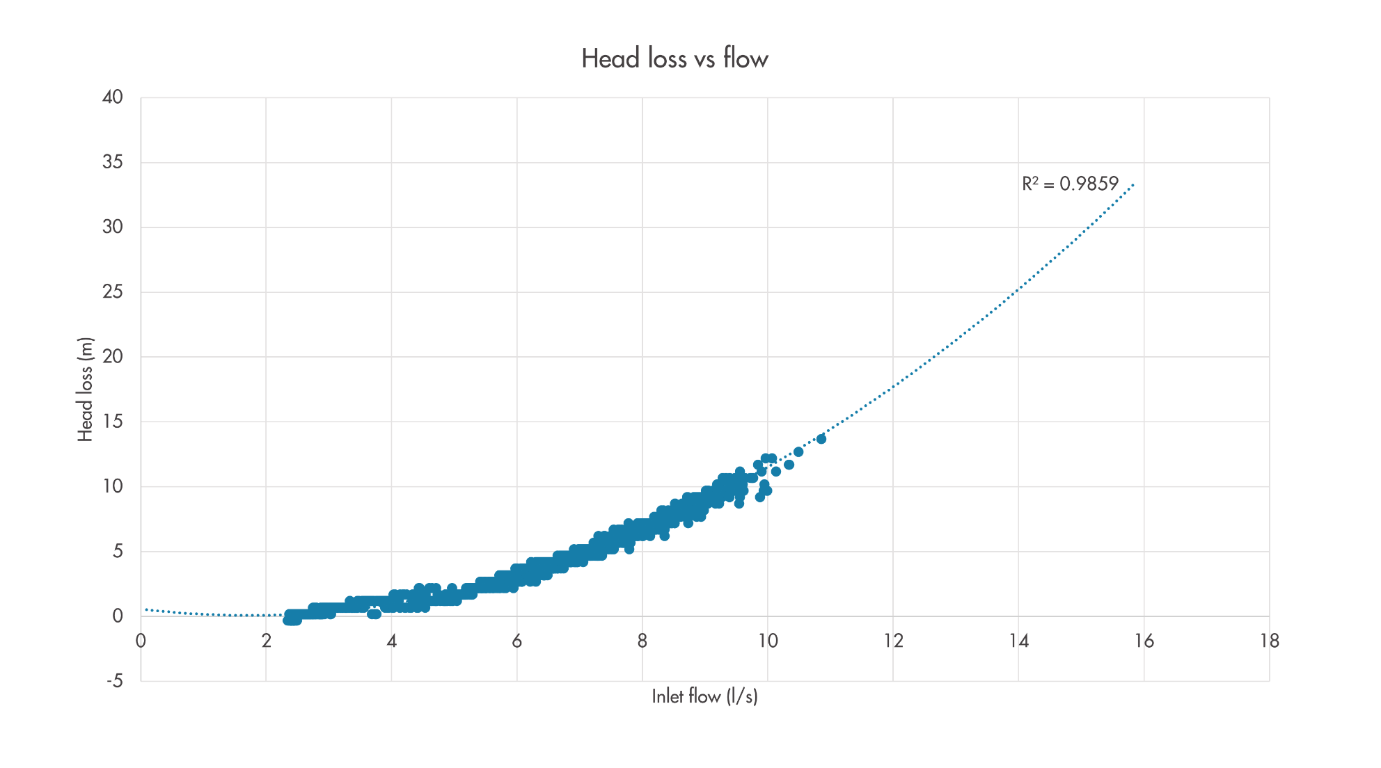
An (almost) ideal example
In some areas, the measured head losses are very consistent for a given flow, allowing us to derive a relationship with a good fit to the data and which closely closely matches theoretical expectations. In Figure 1, the derived relationship (or model) is illustrated as a dotted line, with its squared correlation coefficient (R-squared) value shown. In this example, the consistent relationship gives us high confidence that we understand the characteristic losses through this part of the network and can use this to inform the design of any proposed changes to pressure management. However, this example is unusually neat, and the observed relationship is rarely so consistent in practice. Furthermore, the example isn’t perfect as it predicts near-zero losses at around 2 l/s flow. We would expect to see all points sitting a little higher up on the graph.
Figure 1: Example of a very consistent flow-head loss relationship.
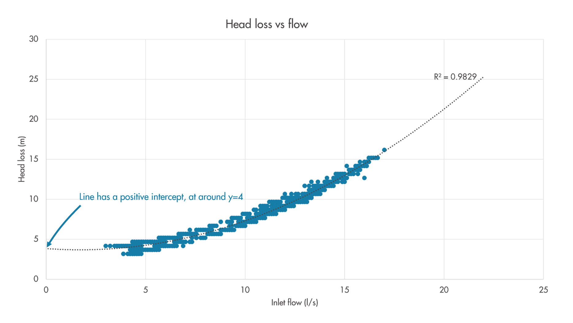
Problems with intercepts
We expect that the derived model (see dotted line in the figures) of a flow-head loss relationship should intercept the y-axis at zero, or more intuitively that there should be no predicted losses at zero flow. However, often the derived relationship has a positive intercept which makes it look ‘shifted up’ on the graph, as in the example shown in Figure 2. This is most likely to be caused by errors in elevation data. As the calculation of the plotted total head values includes the elevation of both the inlet and critical point pressure transducers, inaccuracy in either of these elevations will manifest as an apparent offset in the plotted relationship – it will move up or down on the graph. While we would ideally like to GPS survey the elevation of both sensors, we are sometimes constrained to work with available GIS data, in which these values have often been interpolated from a ground level grid. Where this is the case, the derived relationships will rarely have a near-zero intercept. However, while they are the most prevalent cause, elevation errors are not the only cause of non-zero intercepts, as will be discussed later.
Figure 2: Example of a good flow-head loss relationship with an offset.
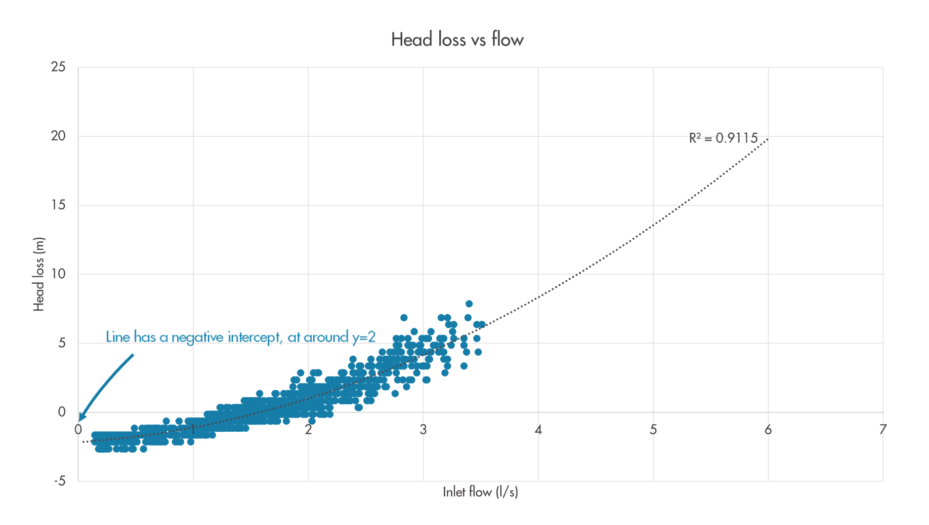
Negative offsets
In some cases, the derived relationship shows a negative offset, which predicts that negative head loss occurred/will occur at some flow values, as in Figure 3. Through understanding of the underlying physics, we know this to be impossible. In these cases we can have high confidence that an elevation issue is the cause of the offset.
Figure 3: Example of a flow-head loss relationship with negative offset.
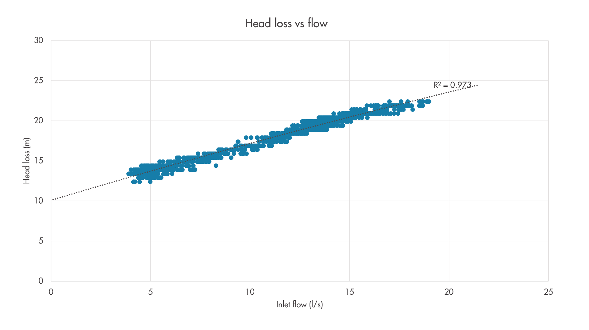
Unpredictable flows
In other cases, the cause of an offset-looking relationship might not be so clear-cut, such as the example shown in Figure 4. In this example, the critical point logger is at the end of a 4-inch cast iron main, and there is a possibility that the offset could be caused by a burst nearby. This area has a night flow approximately 2 l/s higher than would be expected, and a hydraulic model simulation suggests that a burst flow of this magnitude could cause the observed head loss difference. Accordingly, additional logging will be performed to verify/rule out this hypothesis. Where there is a positive offset, it’s recommended to keep an open mind and do some investigation over what the root cause before might be attributing it to elevation errors.
Figure 4: Example of a flow-head loss relationship with unusual shape and offset.
Poor data resolution
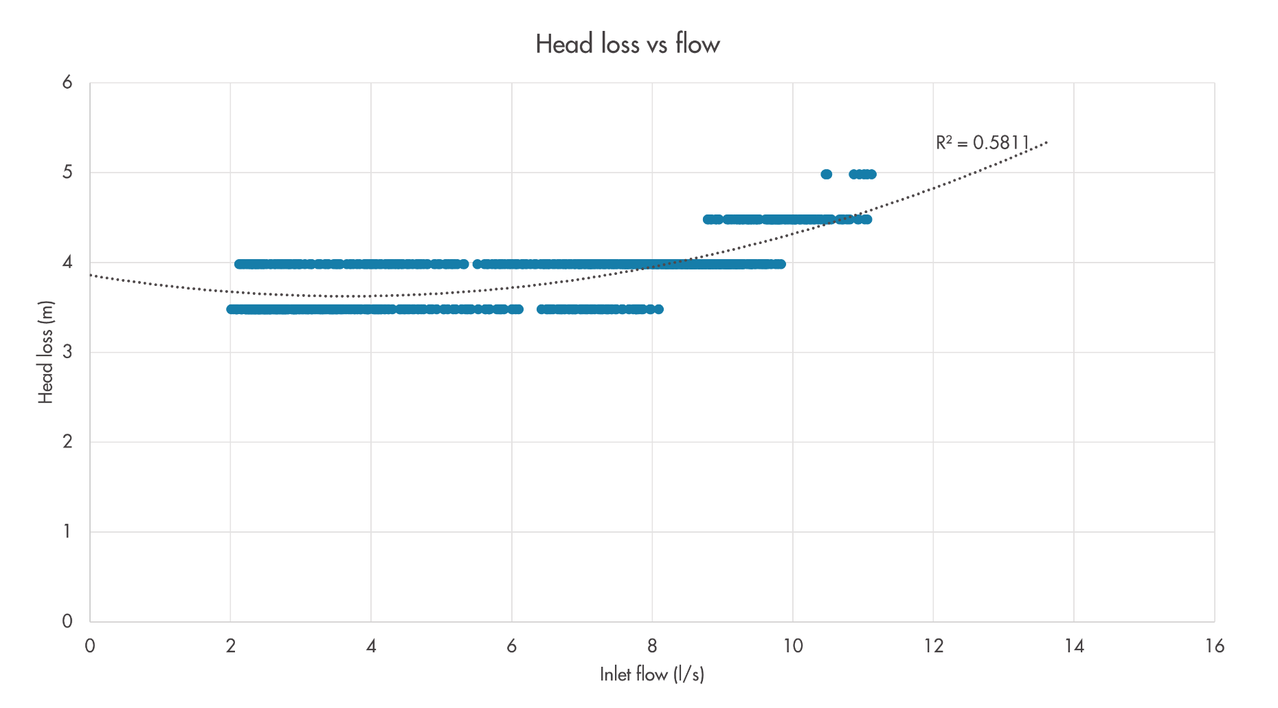
One challenge we’ve encountered is that some of the pressure loggers at the areas’ inlets and critical points have low resolutions of 0.5 or even 1.0m. This especially causes problems when trying to characterise the flow-head loss relationship in areas with relatively low head losses recorded between the inlet and critical point, such as the example in Figure 5. As the calculated head loss has a range of approximately 1.5m, there are only 4 distinct values. Squinting, some tendency for head losses to increase with flows can be seen, but it’s difficult to use this data to derive a smooth relationship. Thankfully this generally isn’t too concerning, as the low range of observed head loss gives some confidence that this area of the network is not subject to significant losses. In such cases where the range of head loss is low, we opt to use a standard set of head loss rates we’ve previously derived for low head loss areas instead of deriving them from the logged data.
Figure 5: Example of a flow-head loss relationship with poor data resolution.
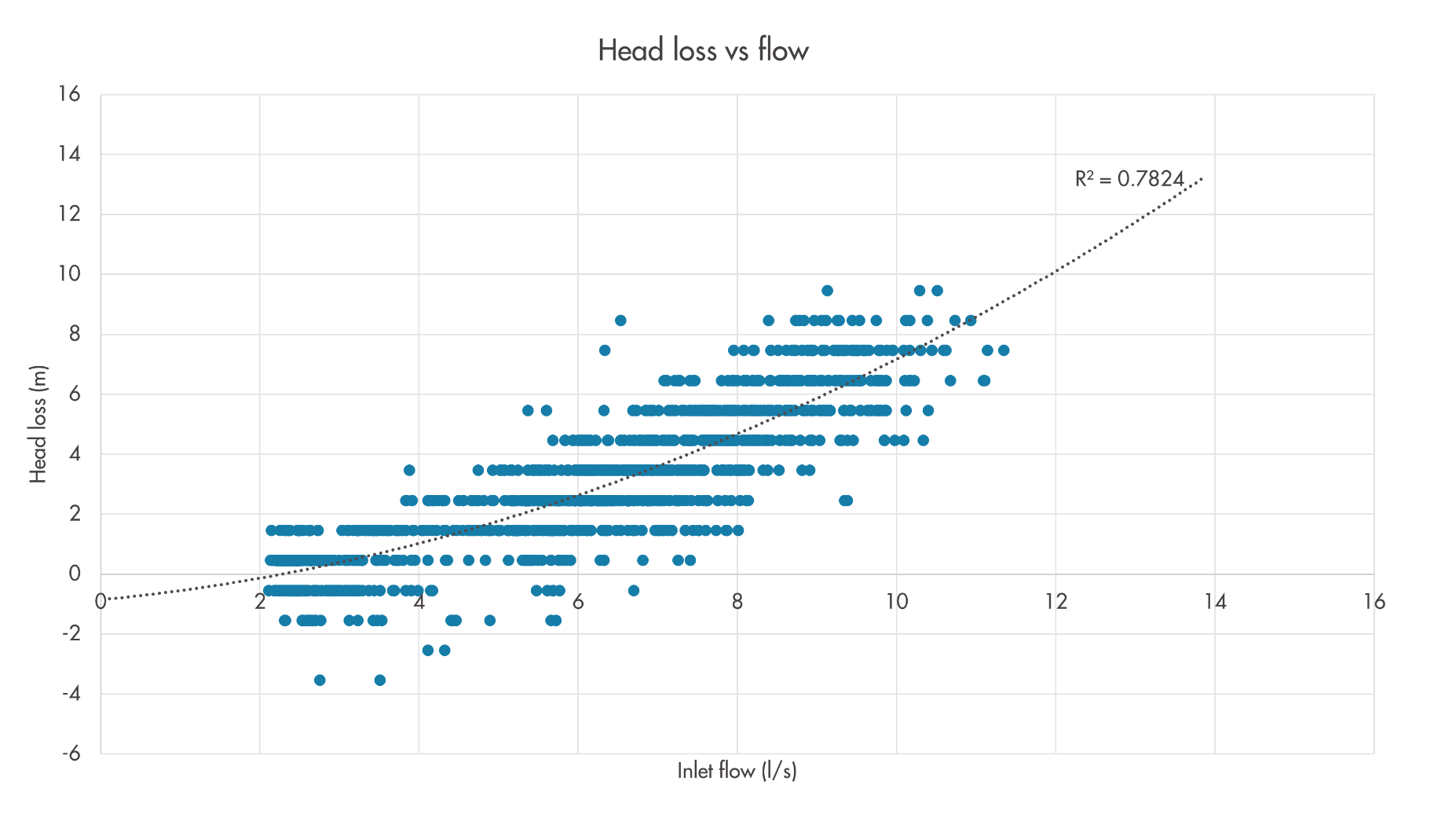
Large customers and unpredictable flows
Areas containing one or more large users can have large variations in the observed head loss for a given flow, due to unpredictability of where that demand is being drawn from within the area. One such example is shown in Figure 6. This area has a pressure reducing valve with a controller at its inlet, which struggles to maintain calm behaviour in the area due to unpredictability of what will happen between the inlet and the critical point. We would recommend in this case engaging with the customer(s) to look at how they draw water and if this can be changed to calm the network before further pressure management optimisation.
Figure 6: Example of a flow-head loss relationship with unpredictable flows.
In conclusion
Analysing the flow-head loss relationship to the critical point of a network area can both help to understand the nature of that network, and also draw attention to issues with the quality of data and network monitoring. We’ve seen examples of how a non-zero intercept can highlight issues with elevation data, how an unexpected shape can highlight anomalous network behaviour, and how a greater spread of points around the predicted line highlights variable and unpredictable demand flows. Hopefully this blog has shown that while the relationships we derive from logged network data might not always match our expectations, we can still use this analysis to gain valuable insights.