I’ve recently been working on how we can help our clients understand the ‘coverage’ of their water distribution network by acoustic noise loggers. As each sensor can ‘hear’ bursts for a given distance along a pipe (depending on material) we can imagine using a highlighter pen to draw this coverage on a map, manually tracing along each pipe spreading outwards from the logger (Figure 1). But for a fleet of 68,000 loggers, maybe we’d better ask the computer for some help! In this blog I’ll discuss how I’ve approached developing an automated solution and illustrate how the result can help our clients optimise their maintenance efforts and reduce leakage.
Acoustic Network Coverage
Introduction
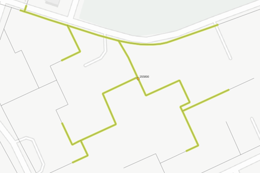
Figure 1. Highlighting the network coverage for a single acoustic noise logger
Context
Acoustic logging technology is currently a key part of many UK water companies’ approach to managing leakage, with several investing heavily in the technology during the previous AMP. Our client, United Utilities, has more than 68,000 acoustic noise loggers deployed across the distribution network, and with such a large fleet comes a maintenance challenge! Almost 5 years (at the time of writing) since their initial roll-out of acoustic logging commenced, some hardware is beginning to reach the end of its serviceable life and may stop providing useful data. We’ve been working on their behalf to combine several different data sources to develop a weekly health reporting process. This should ensure that they continue to get the most out of the fleet.
The Problem
But as aging hardware stops providing useful data, what does this mean for network coverage? As loggers fail, it’s important to understand where gaps in the coverage are forming as this essentially creates leakage “blind spots” on the network. Seeing the opportunity to apply our spatial analysis skills, we decided that I would get stuck into the problem and develop a proof-of-concept solution capable of:
• Tracing the distribution mains coverage of each individual acoustic logger on the network
• Interfacing with our weekly fleet health report to flag which loggers are currently inoperable (e.g. due to communications issues/sensor failures)
• Combining these datasets to visualise the overall network coverage and how it’s affected by logger inoperability on a map
The results of the spatial analysis would then also be summarised at DMA level to report on mains coverage by deployed sites and by those which are currently working.
Developing a Solution
Having previously designed a system to produce hydraulic network models (as discussed in an earlier blog), I was familiar with how to handle network data and how PostGIS could provide useful tools for spatial analysis. I’d also recently been studying a course on algorithms as part of my CPD to advance my programming skills, and it quickly became clear that this was going to prove useful in tackling this problem.
I implemented an approach which takes advantage of a few key ideas:
• Pre-process the pipe geometry (relatively big) into a data structure which separates the (relatively small) connectivity information, which is much faster to work with
• Break the tracing problem down to a base case to solve it recursively (simplified approach shown in Figure 2)
• Design a tracing routine which returns only a “recipe” for each trace, with the spatial heavy-lifting later handled in the PostGIS database (very fast, and avoids round-trips to the database during analysis and produces the same result)
• Use Python to control the whole process from a single button-press/schedule task including:
o Importing and pre-processing a new set of mains/logger/DMA geometry
o Running the tracing analysis
o Constructing the geometry for the result traces
o Further spatial analysis on result trace geometry to evaluate network coverage
I was extremely happy with the solution, which can run the entire process in around 15 minutes – more than fast enough for daily reporting!
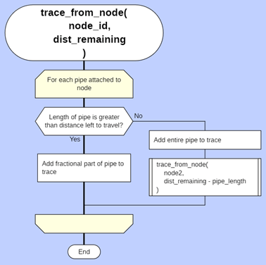
Figure 2. Drakon diagram illustrating recursive tracing approach (simplified)
Demonstrating Outputs
Each individual logger has a coverage trace which we can view on a map to helps us understand which parts of the network it monitors. We can visualise the results with the help of the free open-source software QGIS. In Figure 3, the yellow point is the location of the acoustic logger, and the green highlighting shows the sections of mains on which a burst would be audible, according to the logger spec. In this example, the mains are all metallic and so the coverage is quite extensive.
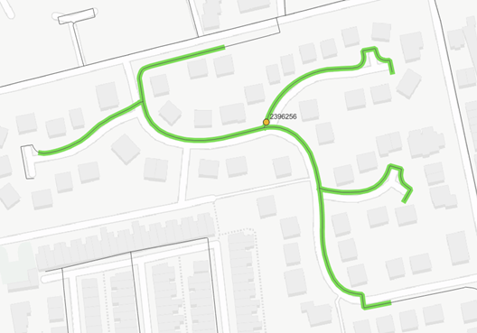
Figure 3. Coverage trace for individual logger
This is useful information, but the real insights come when we combine the coverage traces for all loggers on the network. Figure 4 shows an example of this. Here, three different colours of highlighting are shown. Green represents a section of network covered by a logger which is currently working (based on our most recent fleet health reporting). Yellow represents part of the network which is within audible range, but none of the loggers in the area are currently working. Until a nearby logger is fixed or replaced, this is essentially a leakage blind spot. Red represents sections of the network which are not covered at all by current logger deployment.
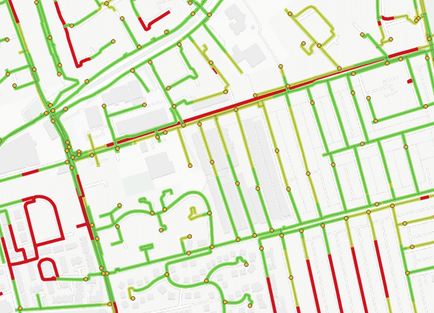
Figure 4. Combining coverage traces to give an overview
Benefits
This is useful in several ways. Firstly, from a reactive perspective in leakage detection. If your district meter data indicates a significant burst in your DMA but none of your acoustic loggers have responded with an alarm, where do you send the techs? Reviewing this plot, you can deduce that the burst must be in a yellow or red highlighted section of the DMA and save time, money and water by checking there first to avoiding sweeping the whole area.
Secondly, from a proactive monitoring perspective by improving the effectiveness of maintenance activities. Seeing where blind spots are forming in the coverage allows maintenance to be focused where it will make a difference, i.e. by turning the yellow mains green. We can even analyse the results for every non-working logger to evaluate the length of mains coverage which would be gained if it was fixed and produce a leaderboard ranking these by priority to highlight the biggest easy wins!
We can also perform further spatial analysis on these results by aggregating them inside each DMA polygon, measuring the total mains length, the mains length covered by working loggers (green traces) and the mains length covered by all loggers (green and yellow traces). These coverages can then be expressed as a percentage of the total mains length. We can view this data in a table or visualise it as a thematic map by colour-coding DMA polygons by their effective coverage (Figure 5).
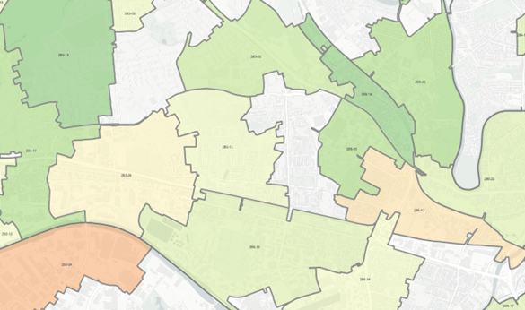
Figure 5. Thematic map showing effective coverage of DMAs as a percentage of mains length
In Conclusion
This was an interesting problem and I enjoyed bringing together experience in several areas to help solve it. The outputs should help our clients to manage their acoustic noise logger fleets, ultimately saving money and reducing leakage. We are exploring more ways we can share the results visualisations, possibly using our Hotspot interactive mapping web application. Personally, I think it’s exciting how we’ve been able to bring together data from multiple data sources to present real-world insights in a way which hasn’t been seen before and look forward to working on similar projects in the future.